


Inspired by their previous Winter Classic jerseys, driven by fan feedback and capping a process that stretched close to four years, the Blues unveiled a new primary logo and uniform on Tuesday morning as part of a rebrand that will harken back to the club’s original look.
“We want to honor the tradition of the ������Ƶ Blues,” Blues chief revenue and marketing officer Steve Chapman said. “We want to honor everything that has taken place to get us to where we are today. But we want to focus on what we’re doing next.”

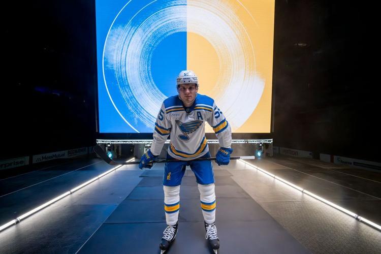
Colton Parayko models the Blues' new home jersey.
The rebrand features a new set of home and road uniforms. That includes a light blue one at home that is very similar to the Heritage jerseys worn as an alternate in recent years, which was first worn in the 2017 Winter Classic at Busch Stadium. The Blues will wear a white version of the cream jerseys worn in the 2022 Winter Classic in Minnesota.
People are also reading…

Colton Parayko models the Blues' new road jersey.
The royal blue one that previously served as the home uniform will now become the third jersey in 2025-26. A variation of that royal jersey with a navy yoke on the shoulders was worn since 1998.
“I can’t tell you how many times I’ve been told and the same with everybody in the organization how those (light blue ones) should be our jerseys, those are among the best in the league,” Blues owner Tom Stillman said. “You’re hearing that around the league from other league people, the Brett Hulls, the Wayne Gretzkys, the fan on the street. It, over time, became self-evident that that’s what we should be doing.”
In addition to a new Note, the Blues added three alternate logos as well. One features a treble clef at the center of a fleur de lis, another a treble clef as part of an interlocking STL, and a third in the shape of a trumpet with the Gateway Arch on top and the Mississippi River on the bottom.
Here’s a closer look at certain elements of the rebrand.
The new Note
-- The new primary logo was first featured on a Blues uniform as part of the most recent Winter Classic jerseys at Wrigley Field, placed on the shoulder as “������Ƶ” was emblazoned across the front. It is slight different from the heritage note from 1967 and a pretty stark deviation from the previous Note that had been used for the previous 27 years.

-- The Note is now just two colors, a blue center outlined in yellow. Previously, it was three colors as a navy center was outlined in both yellow and white.
-- There are thicker interior lines now, a pivotal element the Blues wanted as digital use of the logo becomes more and more relevant. Now, when the Note is used in thumbnails or small-scale applications, the outline pops more than the previous one that featured thinner lines between the feathers of the wing.
“Back at that time, digital was not really an element that was thought of,” Blues vice president of brand, retail and creative services Brenda Wilbur said. “Retail was less of a component. As we thought through the note, we needed to simplify it, so when it’s used in a digital way, when we scale it down, especially on apps and different websites, making a cleaner Note so it has a cleaner representation on digital and on your phone.”
-- With the inclusion of thicker lines, the Note itself will appear thinner, and the team added sharper edges to the six feathers.
“I want to be really clear, the Blue Note is one of the most iconic marks in sport,” Blues CEO Chris Zimmerman said. “We absolutely, in all of this work, we treasured our mark. The work that’s been done, it’s done with both precision and care to protect and to, what we believe, enhance. It’s an interesting word to say we’re modernizing. People could get confused by that. As much as that, we’re refining. We’re refining one of the strongest marks in sport. That is really important for people to recognize.”
The new uniforms
-- The core of the new home uniform has plenty of overlap with the previous 2017 Winter Classic jersey and the more recently-used Heritage uniforms. It will feature the light blue that was popular at the outdoor game in Busch Stadium. It will have yellow numbers. The striping remains the same.
“Just knowing how popular the Winter Classic jerseys were within the group, I think the guys are going to be excited,” Blues defenseman Colton Parayko said. “They just look clean, very cool look, the colors are awesome. Everything about them is awesome.”

The Blues' new home jersey.
-- There are two main differences with the new home jersey. One, it will include the new Note on the chest. Two, the numbers on the sleeves and back will not have an outline.
“It was just a cleaner look and feel,” Wilbur said. “I did a lot of mockups with the key lines and without, and it’s just a bolder look and feel. I think with jerseys now, so many more elements are added in. You have the sponsor patch, and other patches going on. Just cleaning it up. We also took the stripe off the pant to clean the pant up as well.”
The Blues join the Red Wings, Maple Leafs, Canucks and Stars as teams without an outline on their numbers.

The Blues' new road jersey.
-- The white road jersey is largely the same look as the one ������Ƶ wore at Target Field in 2022, but with the beige base swapped out for white. The blue numbers also do not have outlines on them.
-- As Wilbur mentioned, the Blues removed the stripe from the side of their pants, but they also added the new “STL” logo on the right knee. The logo was worn on the helmet during the most recent Winter Classic, but will be featured on an everyday basis now.

“I thought that was one of the coolest things,” Parayko said. “I love this logo. I think it’s going to look good on a baseball cap, too. Very nice on a baseball cap, I’m excited about that.”
Chapman said the team had been trying for an “STL” logo: “Everything we did seemed to look like the ������Ƶ Cardinals’ ‘STL’ or quite candidly, was boring. Just didn’t fit.”
-- The Blues did choose to keep the previous home uniforms in the rotation as an alternate. Why?
“One of the challenges about all this is that the Note is so iconic that at times, you’re just like ‘It’s perfect. What do we do with this?’” Chapman said. “This isn’t about changing everything, it’s just about bringing this element forward. It’s still our sweater and we want it to be a part of the system.”
The red-tinted 90s vintage jersey will still be worn once or twice a season, Chapman said.
-- The particular shade of blue does not have a name … yet.
“The league said ‘Don’t be surprised in a few years if they’re calling this ������Ƶ Blue,’” Chapman said.
“There are a lot of blue uniforms in the NHL,” Zimmerman said. “We think this is the most distinctive.”
Everything else
-- The organization began the process in Dec. 2021 when it hired Rare Design, a company based in Mississippi that helped redesigns for the Milwaukee Brewers, Houston Texans and Memphis Grizzlies, among other franchises.
Rare helped with the team’s entire identity system: the logo, the alternate logos and the wordmarks, Wilbur said.
-- The switch to the new look would have “maybe” happened earlier had the NHL not transitioned from adidas to Fanatics before last season, Chapman said.
-- The Blues were one of the few teams without a secondary logo, and that issue has been solved with the introduction of three new ones. Expect them to appear more on merchandise than on the uniforms.
“While the Note is iconic, we really didn’t have anything beyond the Note for branding,” Chapman said.

-- The illustrative wordmark has typography details of the sheet music cover for W.C. Handy’s 1914 “������Ƶ Blues,” Wilbur said.

-- The Blues’ first-round pick on Friday will don the new jersey.
-- Jerseys won’t be on sale until early September, Wilbur said.
“It’s not a rebranding,” Chapman said. “We’re not going in a completely different direction. As we’ve outlined here, it’s remixed, it’s remastered, it’s reborn. This is taking a piece of our past, but then trying to put it into a phase of where we plan to go in the future.”


Fowler, Broberg and Holloway are each entering the final year of their contracts in the fall after joining ������Ƶ last season.

During a meeting with reporters ahead of this weekend’s NHL draft, Armstrong made it clear the Blues would have enough flexibility to match any reasonable offer sheet presented to Hofer.


